Magazines / Posters / Projects / SlideDoc Presentation / Digital
Client work at BSTRO
Household names like Splenda, Healthy Essentials, Johnson & Johnson, Lactaid, and Rogaine. Other brands included here: Docker, Care to Recycle.
Splenda
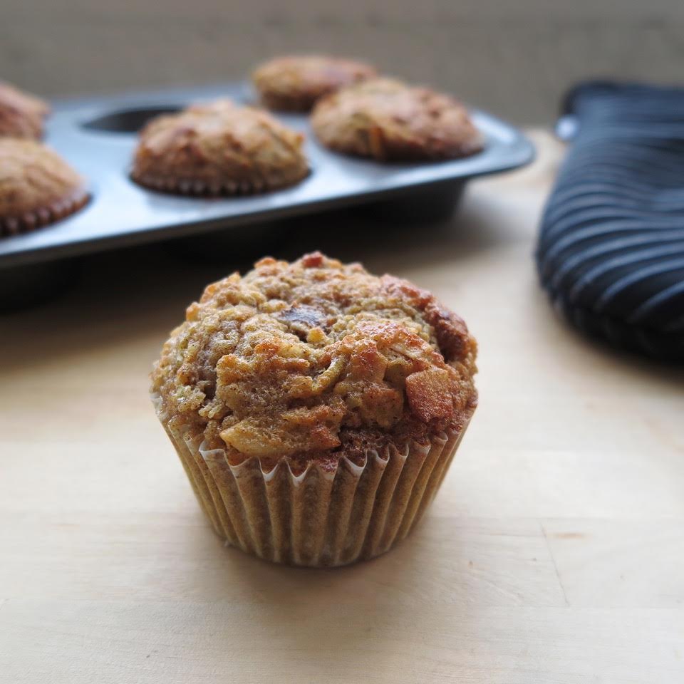
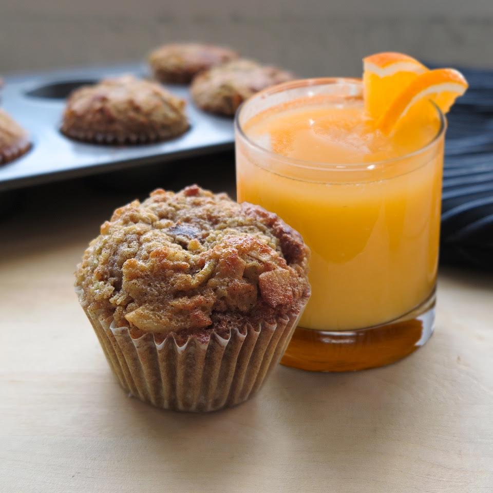
Photoshop milestone story: Baked & styled the muffin. Client came back saying they wanted orange juice. WHAM. I give you OJ!
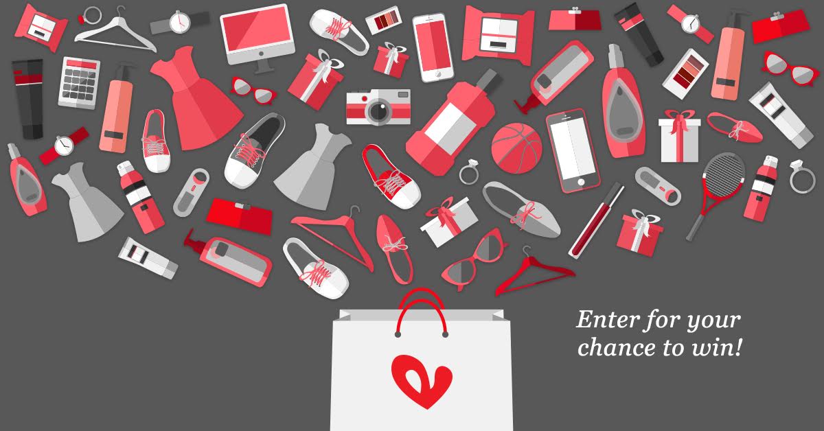
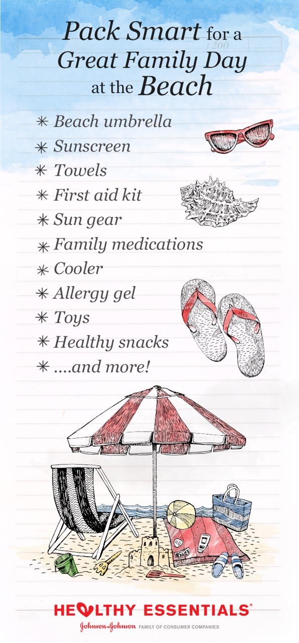
Healthy Essentials: featuring FB link post, Pinterest campaigns


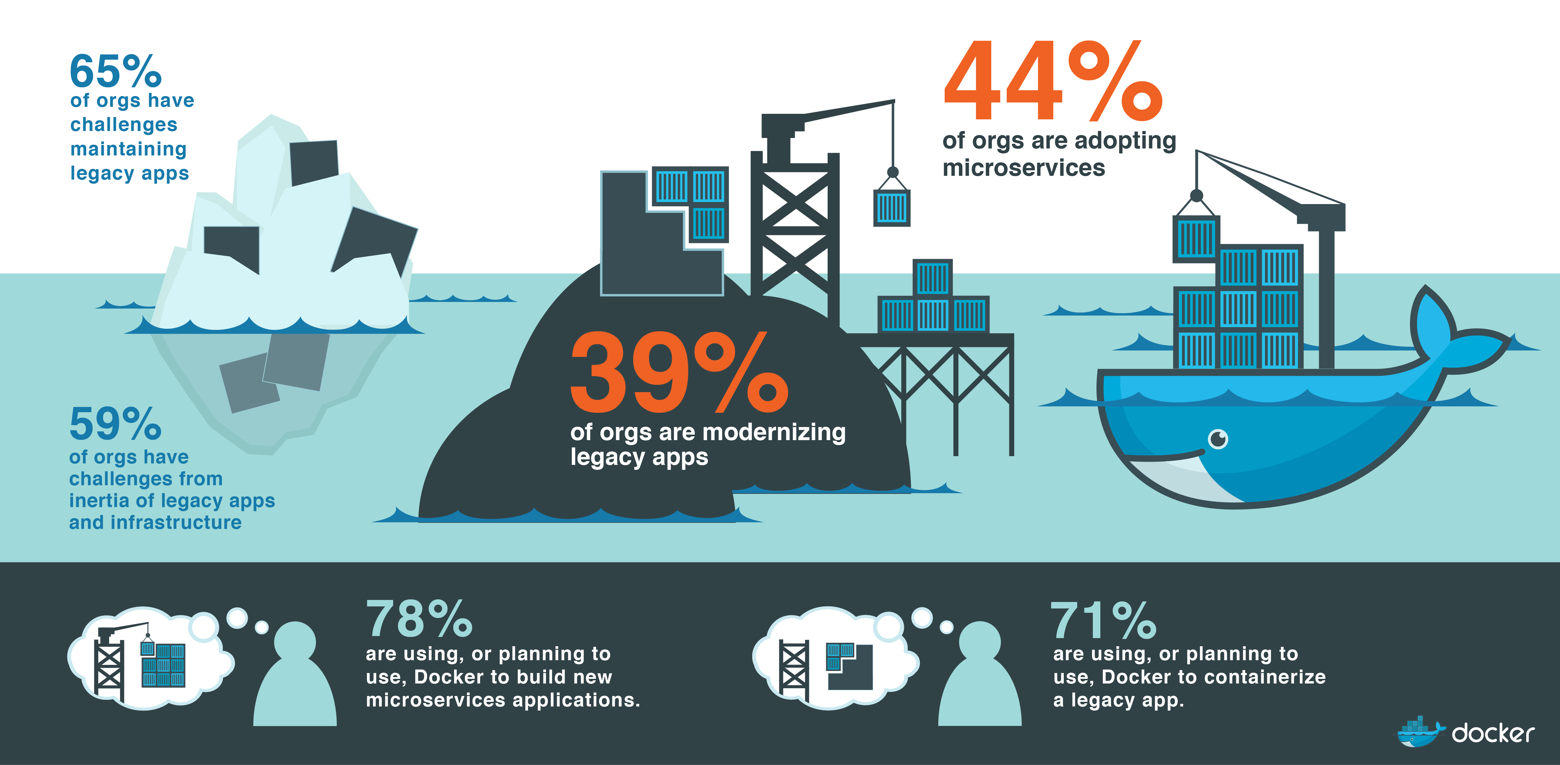
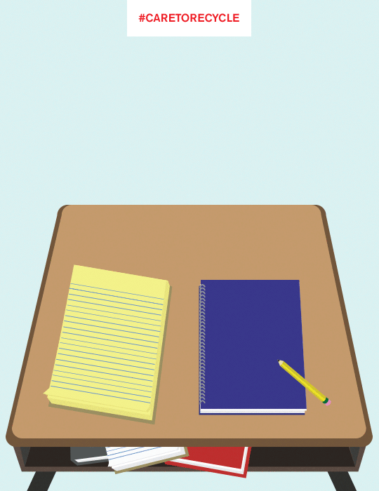
Docker & Care to Recycle
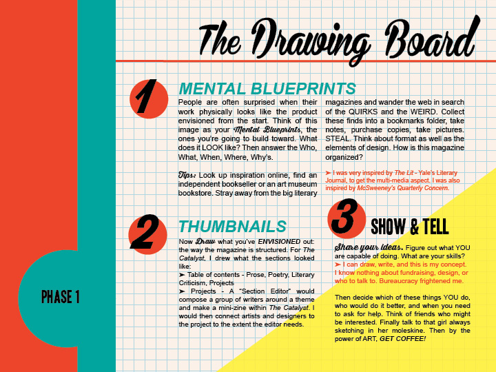
A magazine works like a city; every intersection brings together a misfit family of commerce, architecture, history, visual information, food, culture, people, and invention. Every road intersects with multiple roads, changing the character as it snakes through the grid. Like neighborhoods within a city, each page is connected to a family of pages, which may be immediately related due to obvious shared traits, or distant cousins under the vague trace of consistency. Many publications including my own, associate related sections with a route mapped by symbols or colors, like the red line on the subway. Design creates opportunity to interpret, blend, and curate the work it houses. It becomes one moment of intersection between wildly varied work, and through juxtaposition of these elements, greater meaning is added in collectivity. A magazine, like an art gallery, by design, bifurcates art and text while intersecting them. When I design the magazine, negative space is utilized so that visual and written components communicate with one another and stand alone within the parameters on a page. I believe that the product should speak for itself, and design has the ability to disseminate a message from the mixed media. I try to avoid anything in excess, and I like keep the channels between subjects clean with white or of low register imagery to expedite the chain of reaction by the subjects and recognition by the viewer. Images float separately from text; text is oriented in both functional and aesthetic shapes which lead the eye through the work.
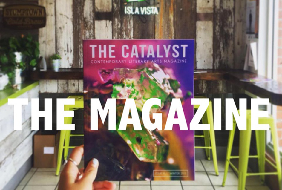
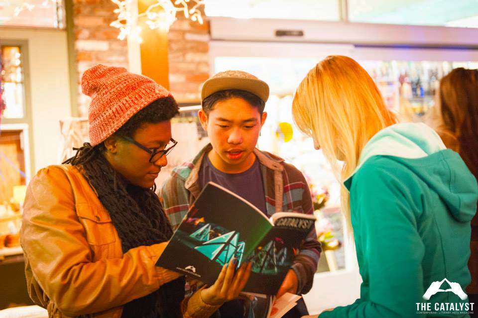
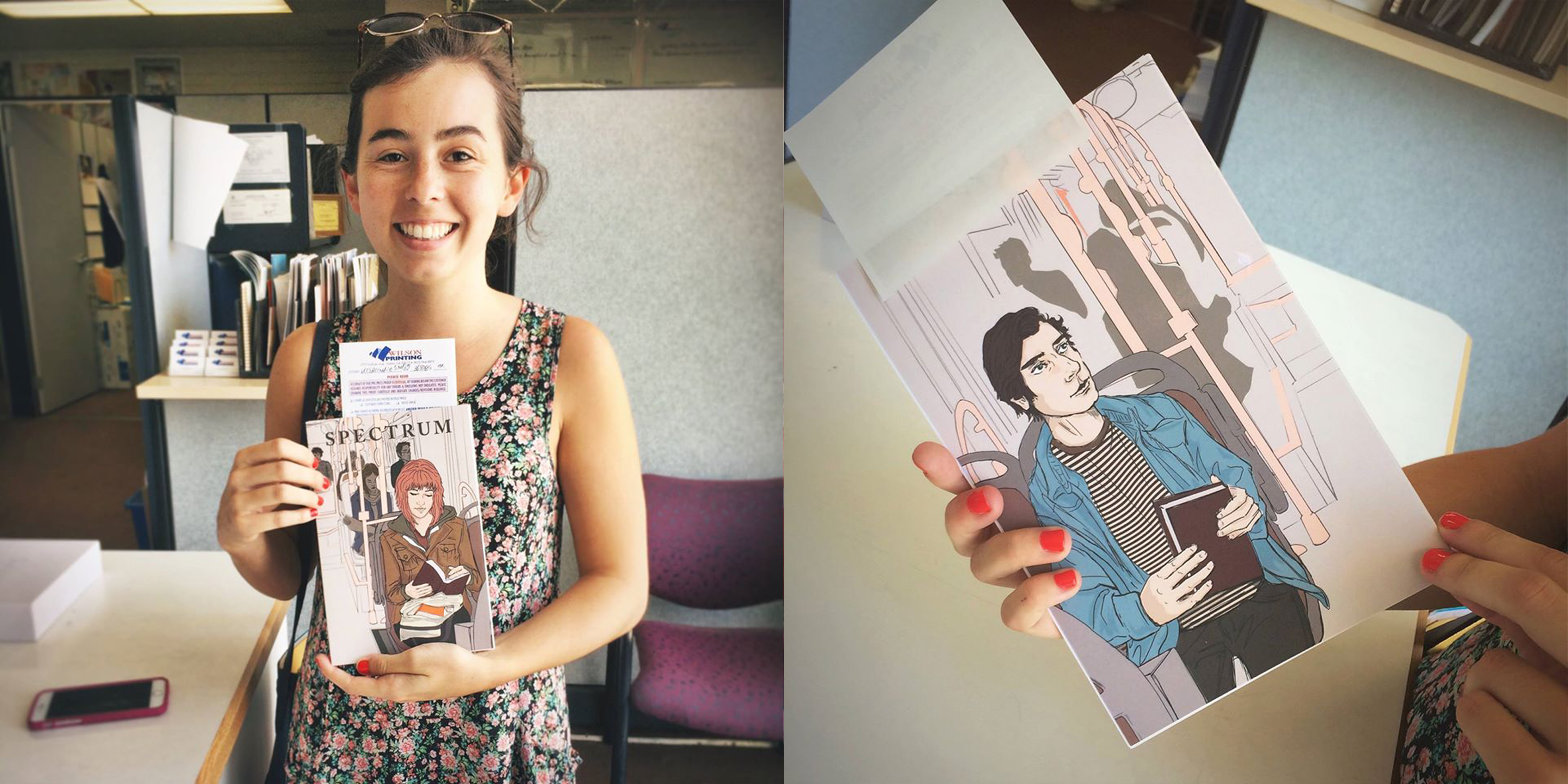
Catalyst & Spectrum
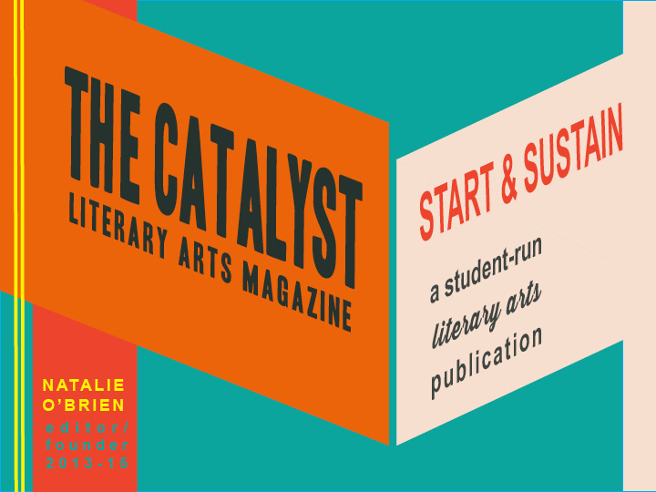
Art Director: Catalyst issues 1-5 & Spectrum Magazine. Designer: Catalyst issues 2-5 & Spectrum.
View Magazines

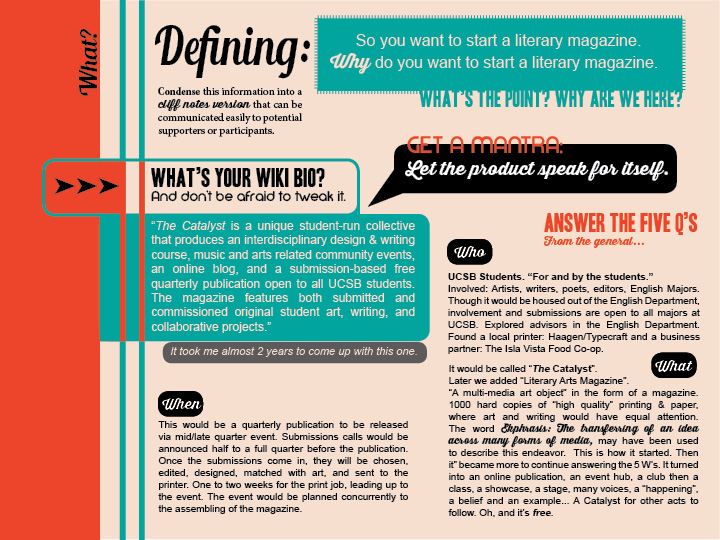
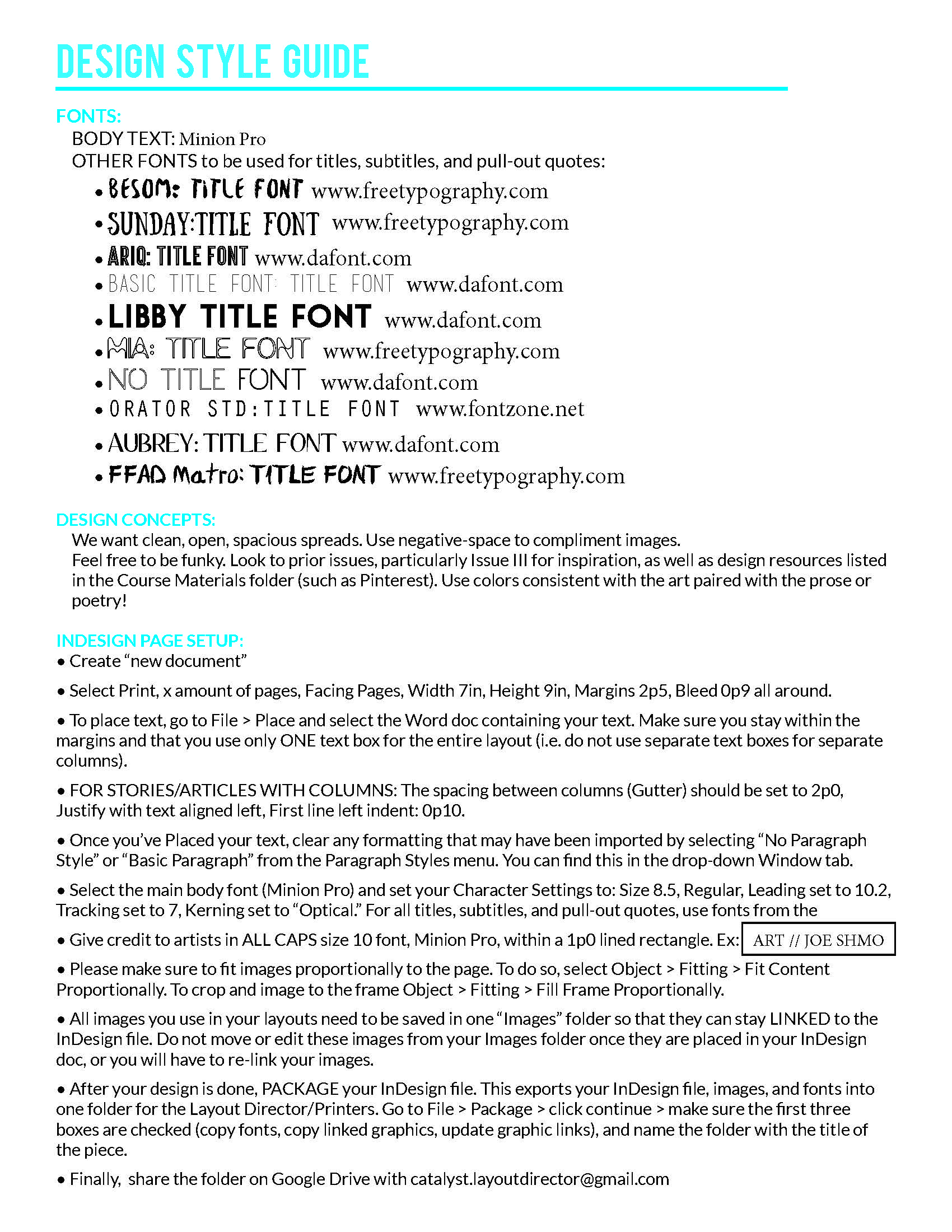
As Art Director of The Catalyst it was my responsibility to teach and guide our team of designers in addition to handling the art and communication with artists. Here is the design Style Guide developed for our team. The Catalyst adheres to a clean style where innovation is encouraged but consistency is crucial.
Posters
All art in these posters is original material.
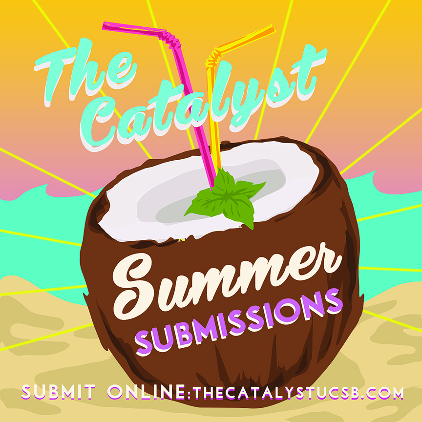
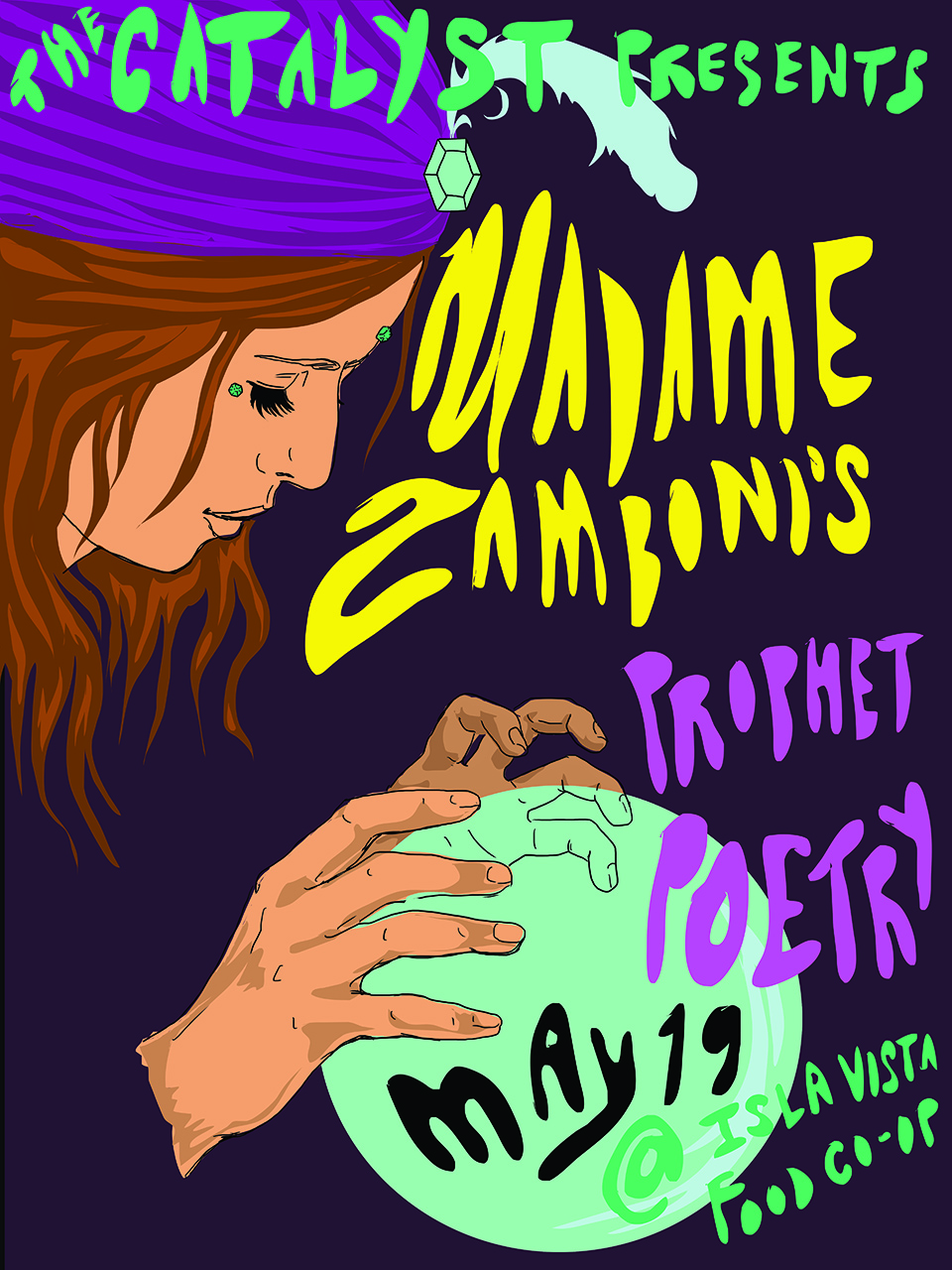
Here is a poster I created in under half an hour for The Catalyst. My goal is to have only original artwork or photography on our posters. Ideally the artist or designer creating the poster would also be the producer of the featured artwork.
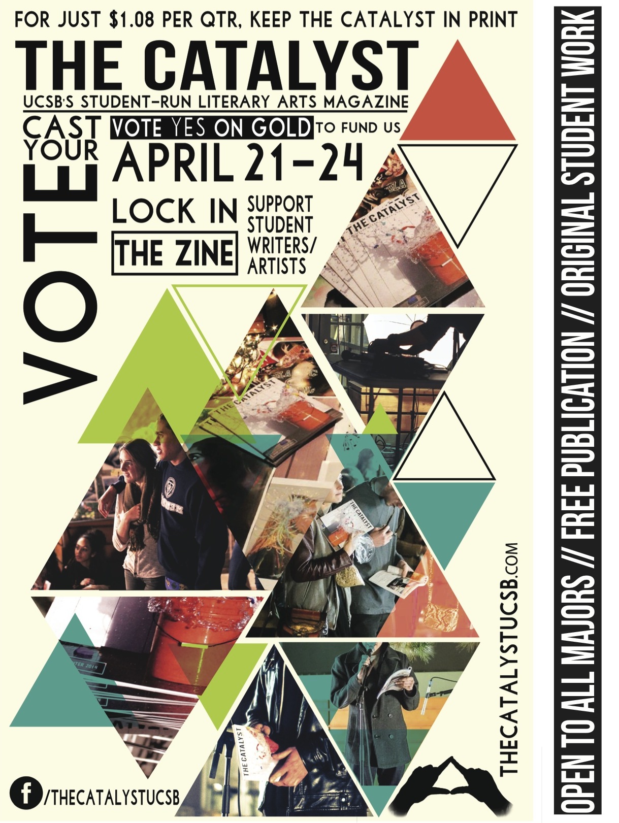
Poster design immediately illustrates these points. For the lock-in fee campaign, we wanted to show a variety of what we do in just one quarter sheet flyer. I learned CS Illustrator in a day to make this poster.
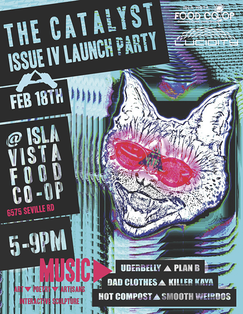
This launch party poster was conceived out of the demand for more “Catalyst Cat” buttons. We made various buttons with Catalyst imagery to give out at events, and Catalyst Cat was in high demand. The cat was originally a pen and ink illustration in black and white that I doctored up using a glitchy makeshift photoshopesque website in order to get that look. I put it in photoshop and made the poster from there. It is reminiscent of the underground event poster styles I’ve seen recently, with a color scheme to match some of the sculptures we featured at the event. The grittiness of the cat image conveys a playfulness, informality, humor, and accessibility for the college age group we were aiming at. People were stealing these posters and putting them up in their homes. I take that as a sign of success! We also had the largest turn out for this event.
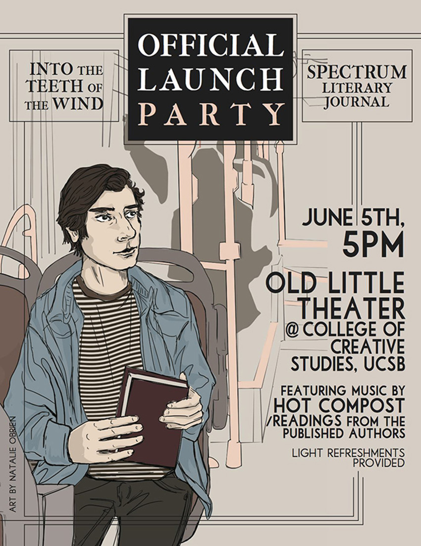
This poster for UCSB’s College of Creative Studies is meant to be more formal than others I’ve done in the past. Since this was commissioned work, it had to be approved by the editors. The poster once released immediately garnered online attention and a bigger facebook following.
Projects
Peitho Online
Manual Slide Doc Presentation
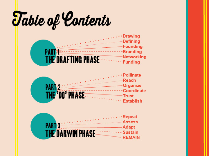
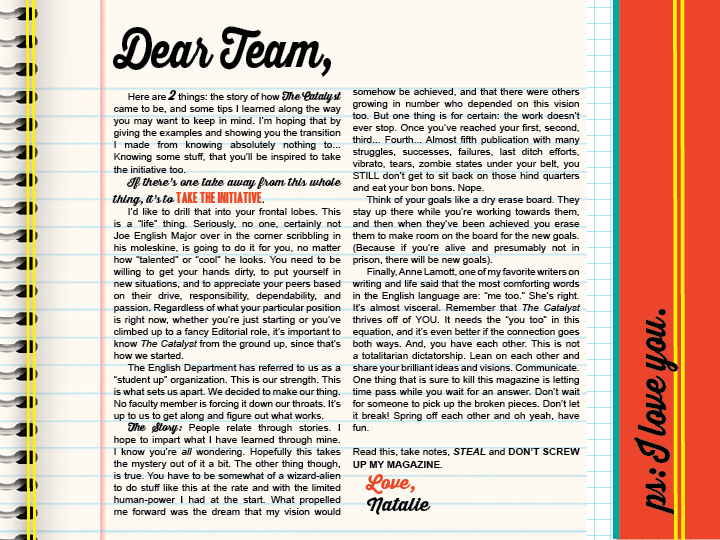
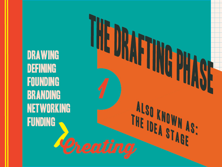
The digital Catalyst Manual is intended to streamline information in an attractive way that will engage a group of students who may not know anything about the magazine’s background story or the way it currently functions. I developed this theme and everything from scratch after sitting in a 50’s themed coffee hangout called Coffee Cat.